Stay Open Yoga
Inclusive on the
mat & Online
Background:
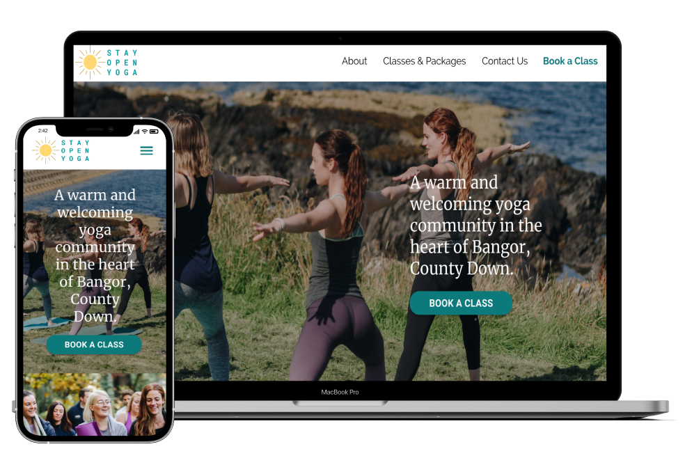
Stay Open Yoga (SOY) is a small business run by husband and wife (Kellie & Josh) in Northern Ireland. They offer various yoga classes held both in a studio and out in nature. Their goal is to help their students strengthen their bodies by cultivating a fun and welcoming environment that encourages genuine connections through movement.
The Challenge:
Although SOY offers a friendly and accessible environment when on the mat, their online presence is not user friendly and is not inclusive for all users. My goal was to create a responsive, mobile-first website that provides their students with ease and an efficient booking flow that ultimately encourages them to book more classes. SOY is a small business run by a husband and wife duo, they plan to implement the designs themselves using an online website platform. The stakeholder’s requested that the redesign be simple, inclusive, and fresh. Most importantly, they requested the designs to be easy to use for their users and build for themselves!
My Role:
Researcher, UX & UI Design
Stakeholder:
Kellie & Joshua Walker, SOY business owners
Timeline:
June 2021 (80 hours)
Tools:
Figma, Miro, Wix
To know how users prefer to book their yoga sessions and develop a mobile first, responsive website that suits their needs so we can guide their purchasing habits
I performed quantitative research methods including competitive research and market research. I conducted qualitative research to gain more behavioral insights- including user interviews and usability testing.
To understand how current students book their weekly classes (one at a time, in bulk, advance, last minute, etc).
1. Determine the value of multi-class passes.
2. Determine how to encourage students to book multiple sessions at once or recurring lessons.
3. Understand the process of planning a weekly workout routine. Are there key factors that motivate a student to attend more sessions?
4. Understand value/interest in the community aspect of SOY (online access, ebooks, events, etc.)
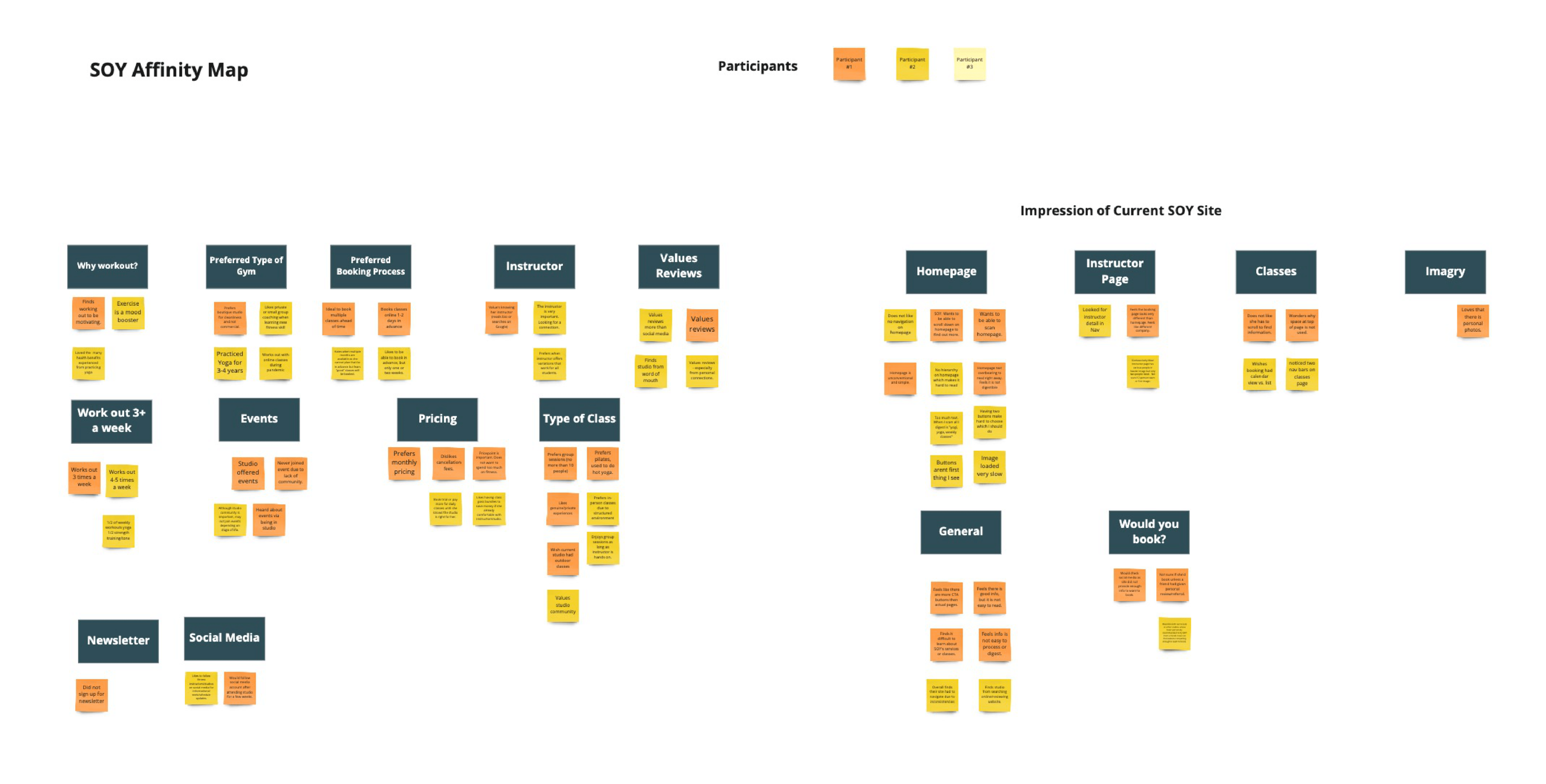
SOY’s stakeholders were able to connect me with three individuals who practice with them on a weekly basis. I also interviewed potential users that identify as yogis or users of another small fitness program. Facilitating these interviews helped me gain a deeper understanding of why current students continue to book classes with SOY and what would help potential students take the step to book their first session. Towards the end of our discussion, interviewees got a chance to explore SOY's current website. Through observation and discussion I was able to identify users' frustrations and needs. Photos of SOY's original website have been shared in the slider below in addition to a few thoughts shared by interview participants about about the site.
SOY interview Guide
Number of interviews: 6
Methodology: Interviews were held via video conference. Each interview was recorded so they may be referred back to during the rest of the design process.
Interview Duration: Roughly 20-30 minutes
Demographics: Women aged 25-40
My research showed a pattern: students who already attended SOY classes do so because of the brand and community. They feel loved and seen while in class, but they do not feel the SOY website represents who they are as a brand.
Another pattern emerged while interviewing yogi's who have never taken a SOY class: they were unmotivated by the booking process and the company website left them with confusion. Many new students said they'd likely continue to look for a studio unless they had a personal friend recommended SOY. The SOY site was not enticing.
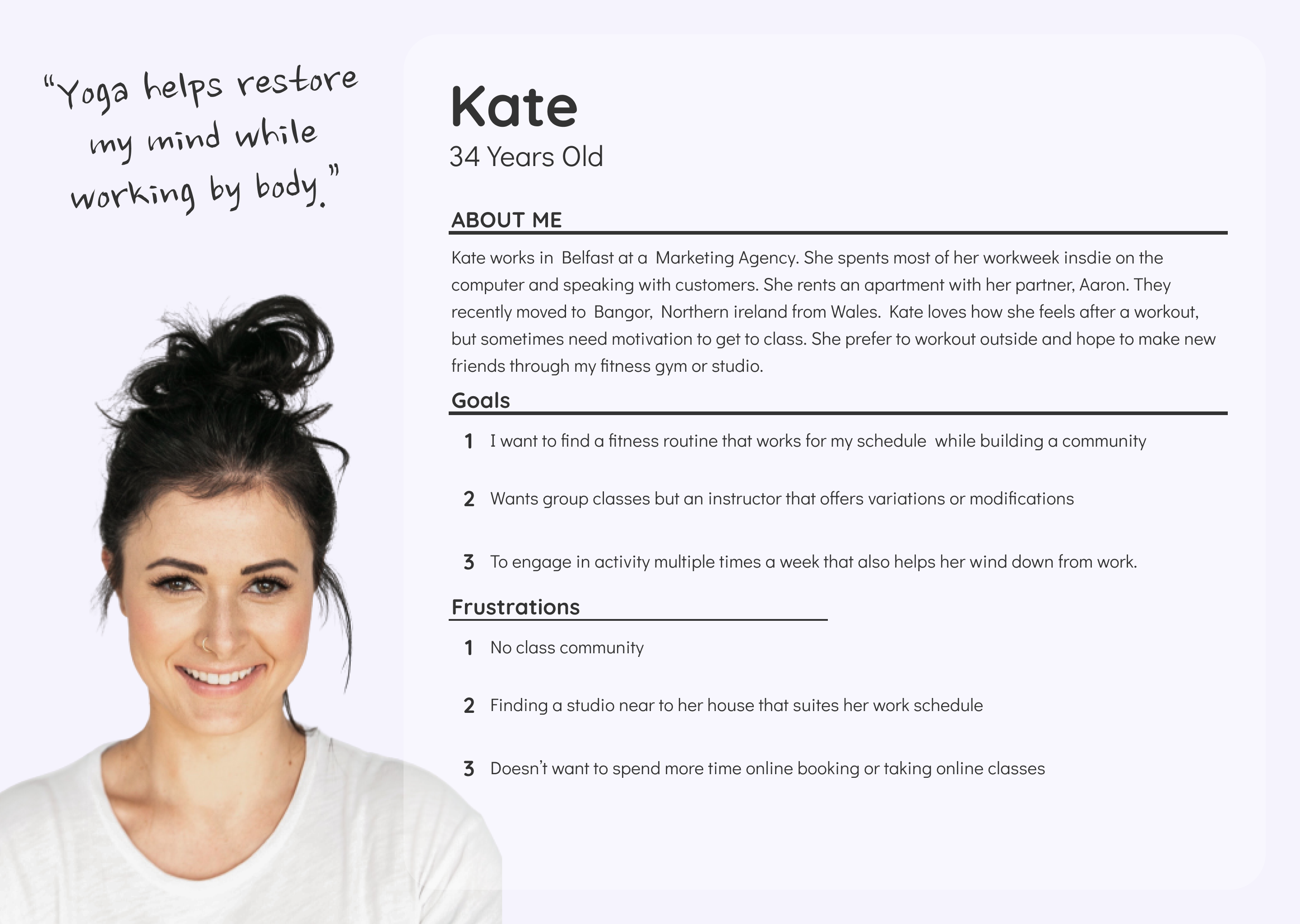
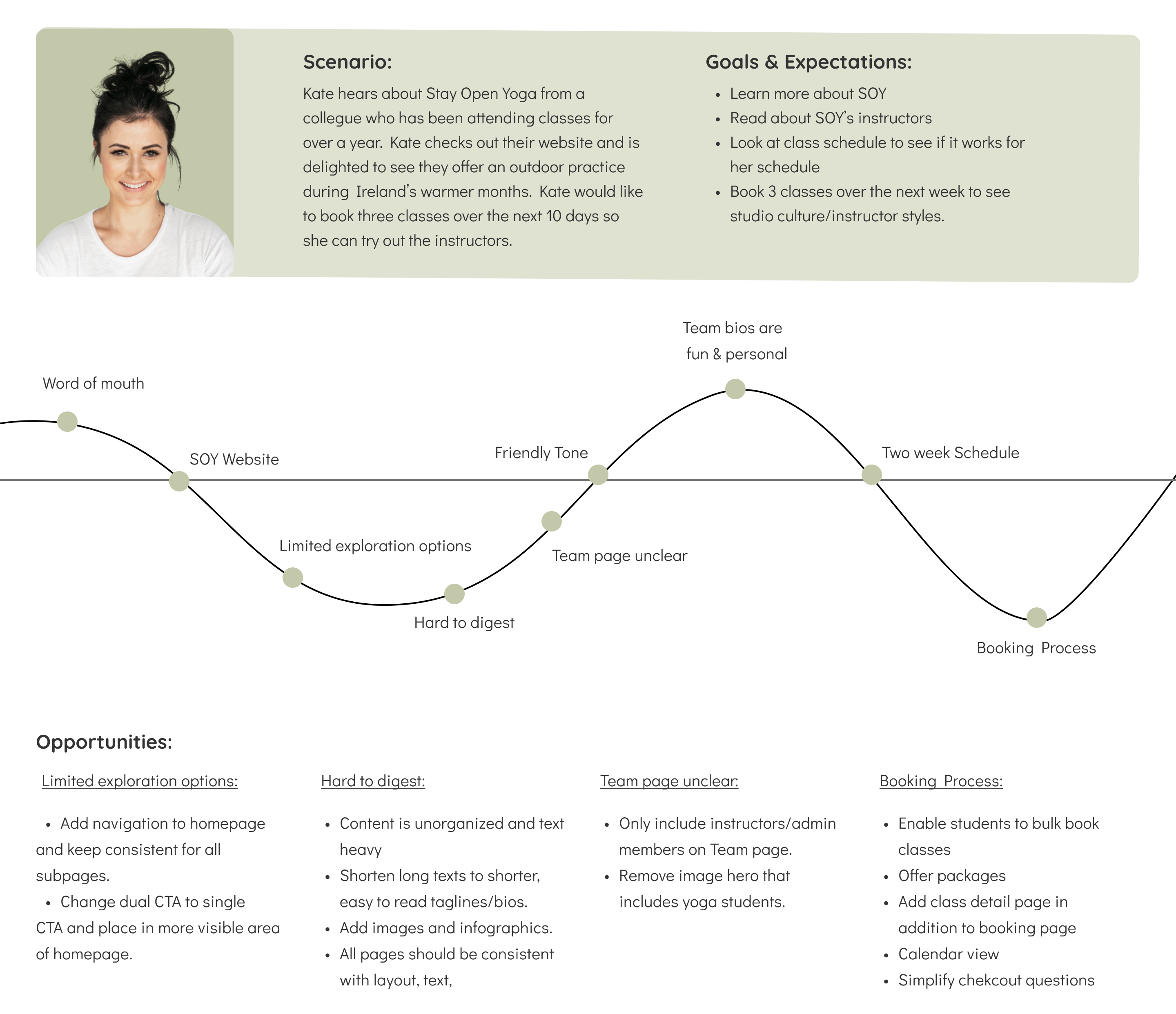
I developed Kate based on aspects and findings from the research process. I referred back to Kate throughout the design process to ensure her needs were kept in mind.
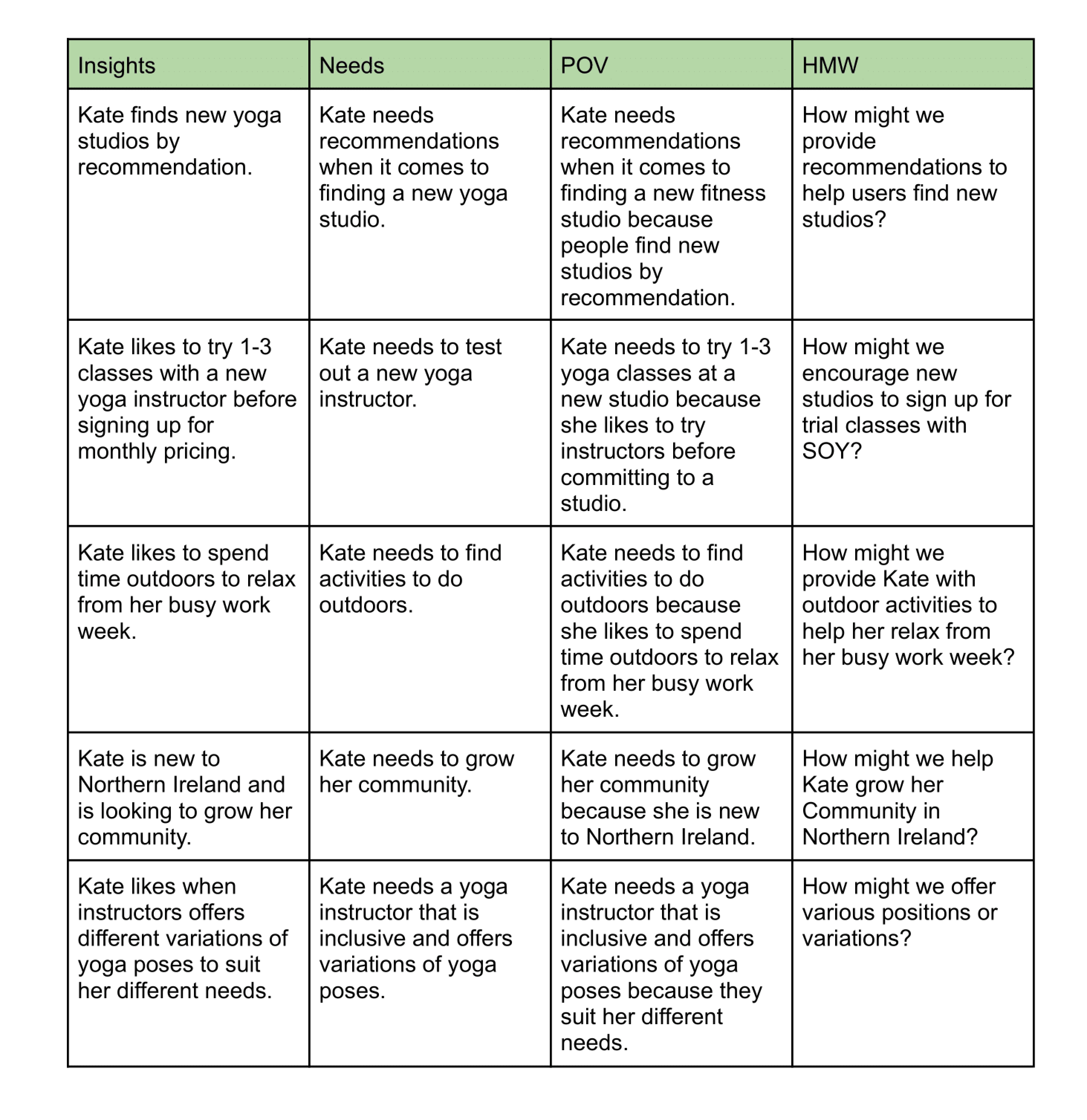
I conducted How Might We as an exercise to help me visualize problems as opportunities. I did this by rephrasing challenges as questions.
I mapped a user’s current journey of using SOY’s booking process. This helped me emphasize with their frustrations. This exercise also provided me with the experience of viewing their speculative and presented opportunities to ideate a more efficient process.
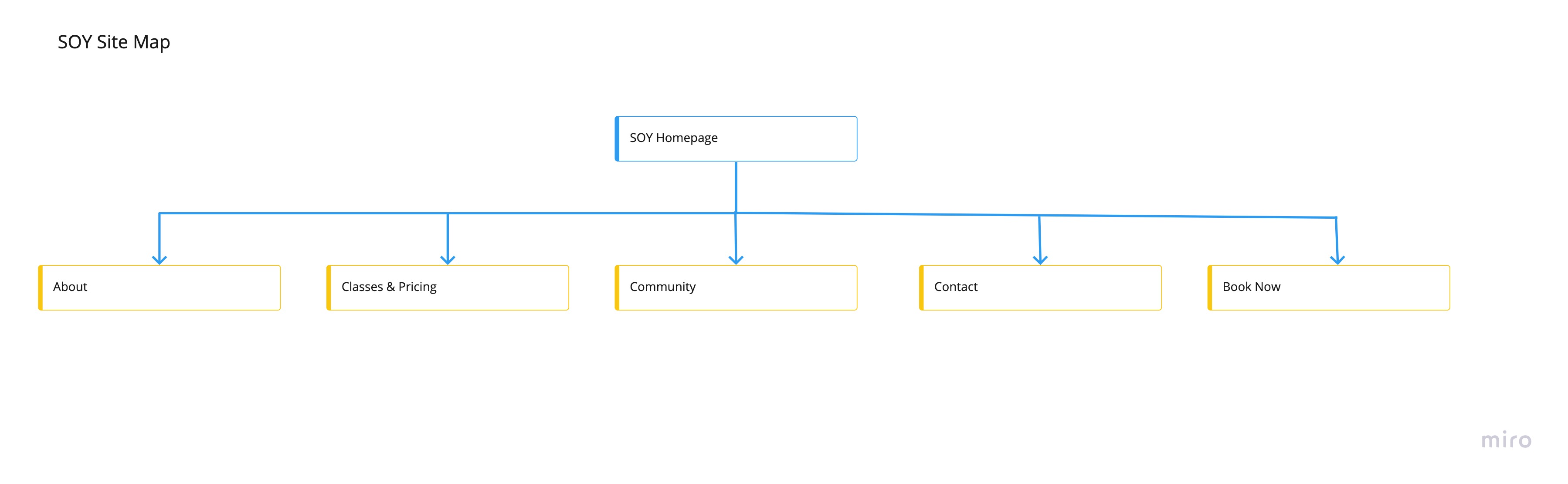
The exploration stage was kicked off with creativity and innovation. I used experimented with various techniques and exercises in order to develop solutions.
I collaborated with the stakeholders to discuss and validate both the business and student's needs before finalizing the site map. The business owners wanted to introduce a new feature, Community, to their students with the launch of the redesign.

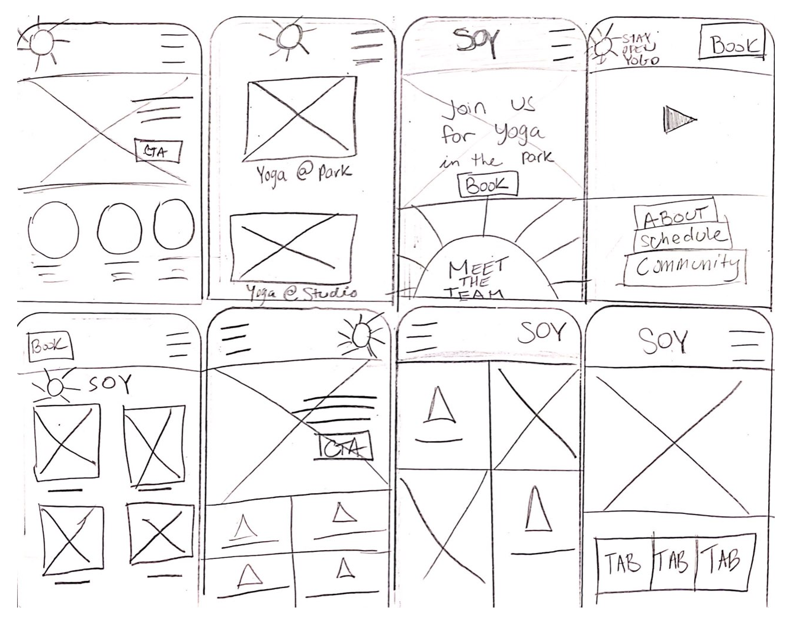
I conducted the Crazy 8’s exercise to kick off my design process. This allowed me to quickly explore various ideas and processes. Low-fidelity wireframes were sketched and designed for mobile first. Next, I developed mid-fidelity wireframes in Figma. Each screen and changer was designed with SOY users in mind.

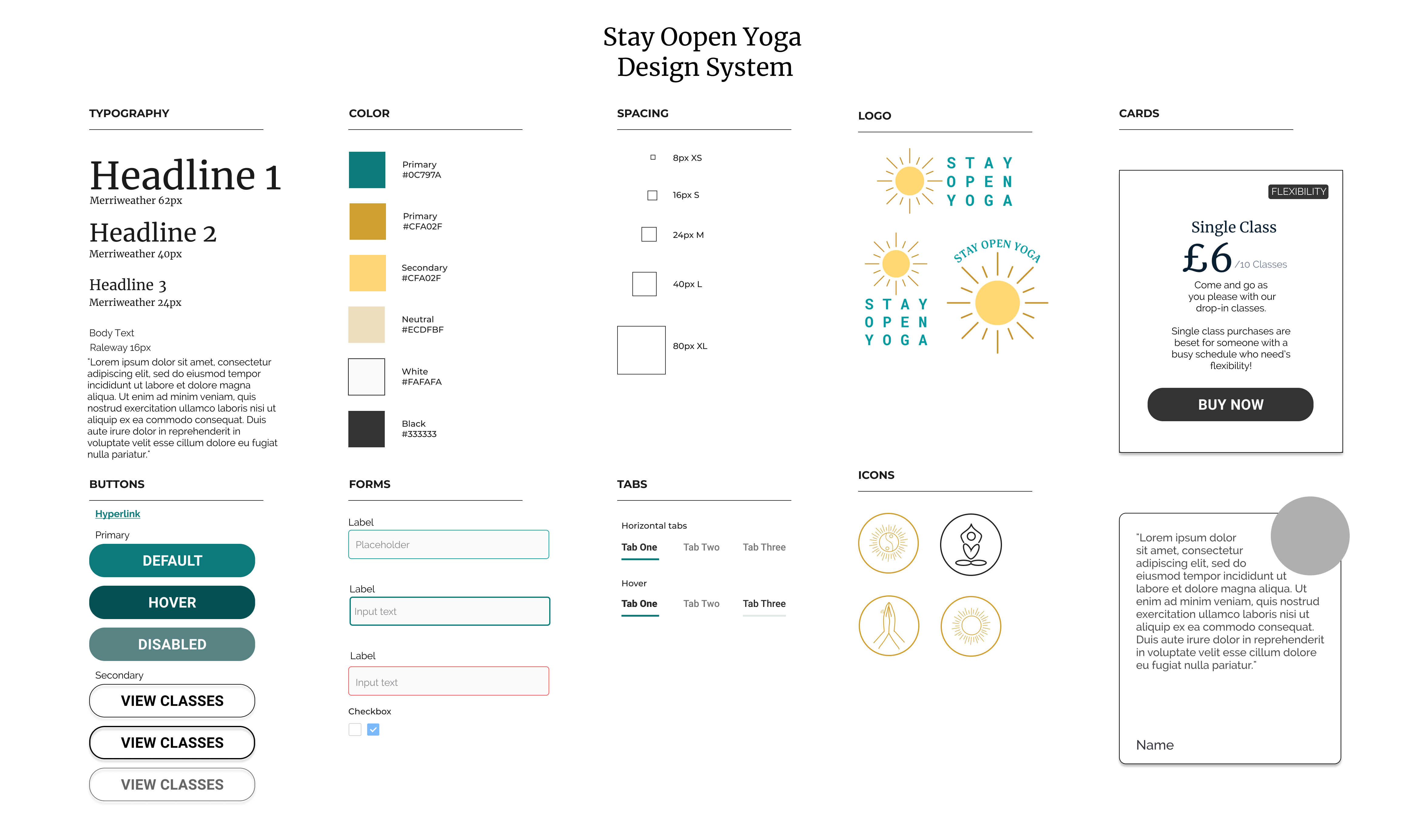
SOY stakeholders provided the brand colors and their most recent logo. Although there was no margin for change in these brand elements, the stakeholders were open to the opportunity of education on how to use their assets best. For instance, we met to discuss current use of the color palette and how certain variations of uses are not considered inclusive in an online format. I designed a UI Kit for the stakeholder’s to encourage brand inclusivity and inconsistency moving forward.
I recruited potential users to test a high-fidelity prototype to test if the redesign met their \usability needs. The prototype was built for mobile as research showed that more than 80% of SOYs users book on their mobile devices.
Usability Test Objectives: To test the overall ease of the webpage and to see how users interact with the updated booking process.
Methodology: Think-aloud testing was used throughout the interview. Participants were asked to narrate their thoughts throughout the test. They were first asked to explore the webpage as they would if they navigated to the site for the first time. Next, they were asked to book a few classes and walk me through their process of how to do so. 100% of testing was conducted online via video conferencing.
Participants: 4 participants (3 female, 1 male) between the ages 25-40 years old.
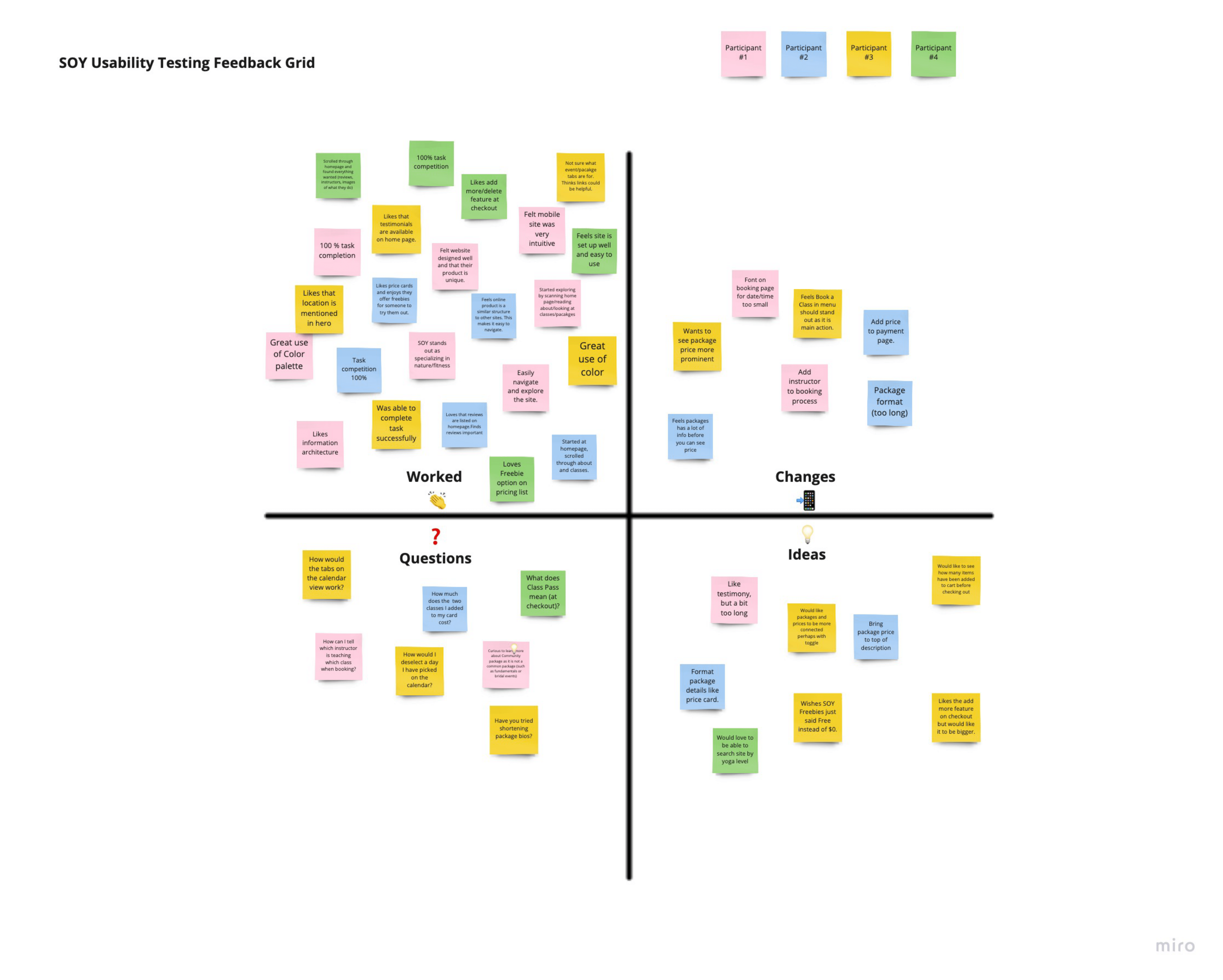
After completing each usability test, I reviewed my notes and the test recordings to analyze the tests which led me to create a feedback grid. The feedback grid outlines what worked during the test, questions and ideas that participants had. This helped me understand what high priority iterations need to be made.
High priority changes were then applied to the designs to create a high fidelity desktop prototype.
View Prototype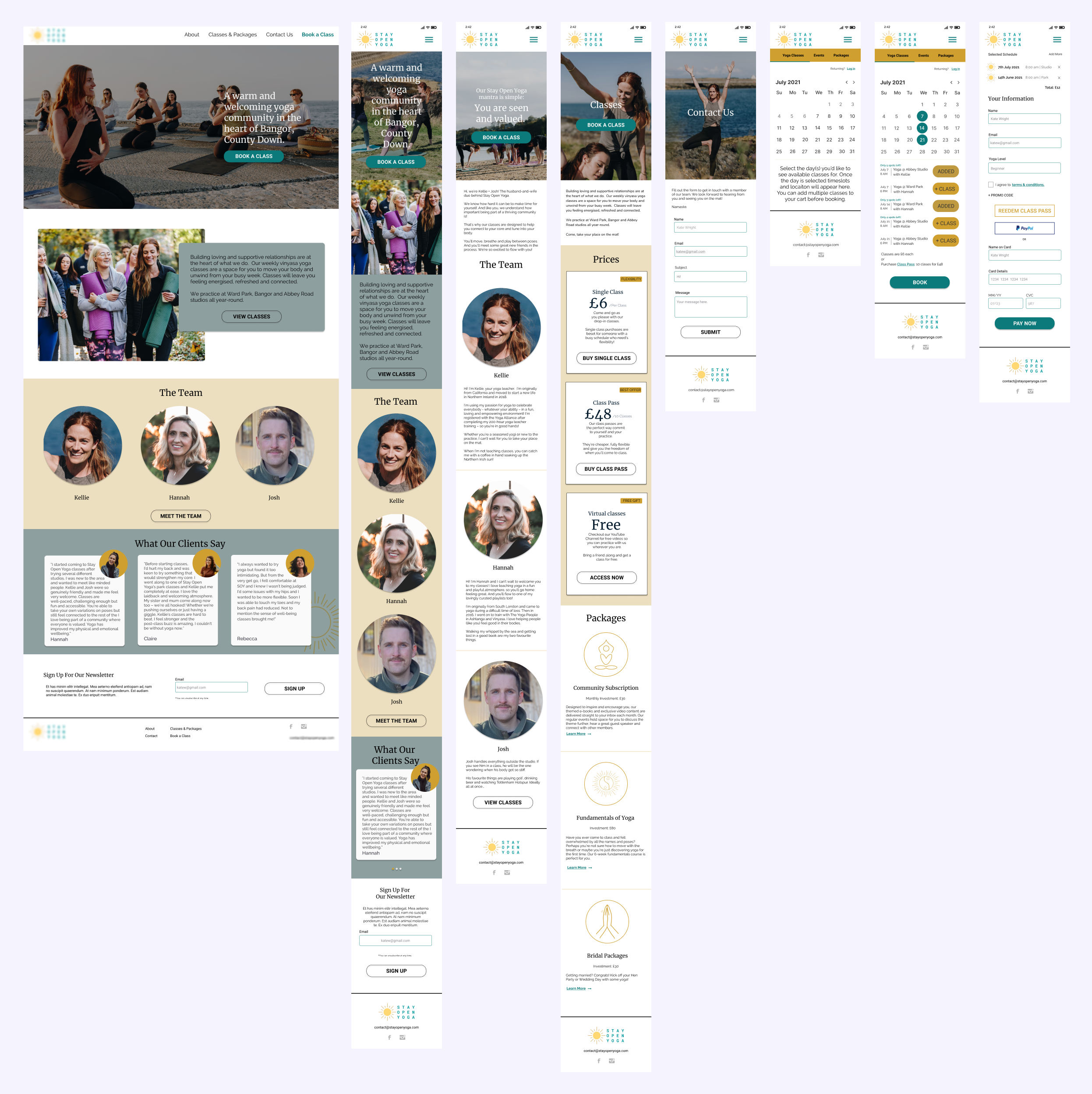
The clients, Kellie & Josh, have seen a 34% increase of bookings because my designs. The redesigned booking process allows their students to book all of their desired classes at once and much more in advance. This provides the business owners with money upfront and helps them adjust their class availability to meet their student's needs.
Many lessons were learned throughout the redesign, especially in regards to constraints in business resources. Working with the company’s current brand required me to get creative with how their color palette could be used inclusively. Knowing that the stakeholder's would need to build the designs themselves required me to create and design within scope with Wix’s capabilities in mind. User research and interviews pointed out that being able to book multiple classes in one booking session would allow users to book more classes with ease. Designing a booking system that reflected this desire will help SOY reach it’s goal of growing their student body and therefore bring in more revenue with less effort.
Want to know more? Contact me for more details or explore the prototype!
Contact Me