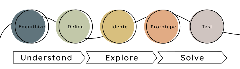
Understand: Empathize & Define
Research Goals
To understand how language learners learn best & how to improve Duolingo's current app by adding a new feature that aligns with their mission “to develop the best language learning education in the world and make it universally available.”.
Research Methods
I conducted quantitative research methods including competitive research, survey tools, and desk & market research. I conducted qualitative research to gain more behavioral insights. Including user interviews and usability testing.
Qualitative & Quantitative User Research
User Survey
User surveys help me understand that many language learners find immersion is the best way to learn and that 73% of participants finds value in the opportunity to practice with a native speaker.
User Interviews
Of the 35 participants that I recruited to take the Language Learner Survey, 18 participants were interested in chatting more about their experience learning another language. After contacting various participants I setup 5 virtual interviews.
Throughout the interviews I was able to gain a better understanding of learner's desires, frustrations and motivations.
Duolingo interview Guide
Number of interviews: 4
Methodology: Interviews were held via video conference. Each interview was recorded so they may be referred back to during the rest of the design process.
InterviewDuration: Roughly 20-30 minutes
Demographics: Men and Women ages 25-62
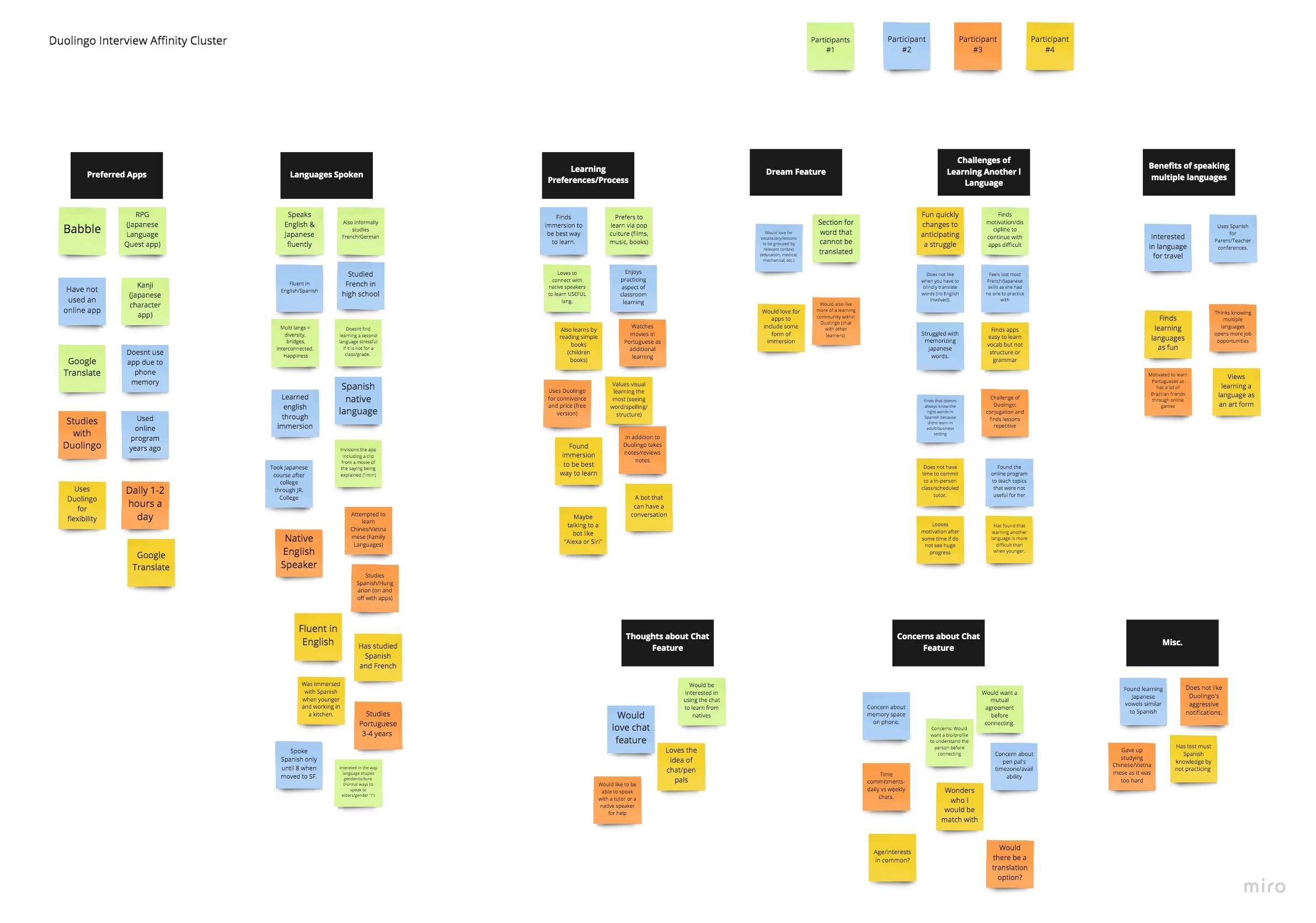
Personas
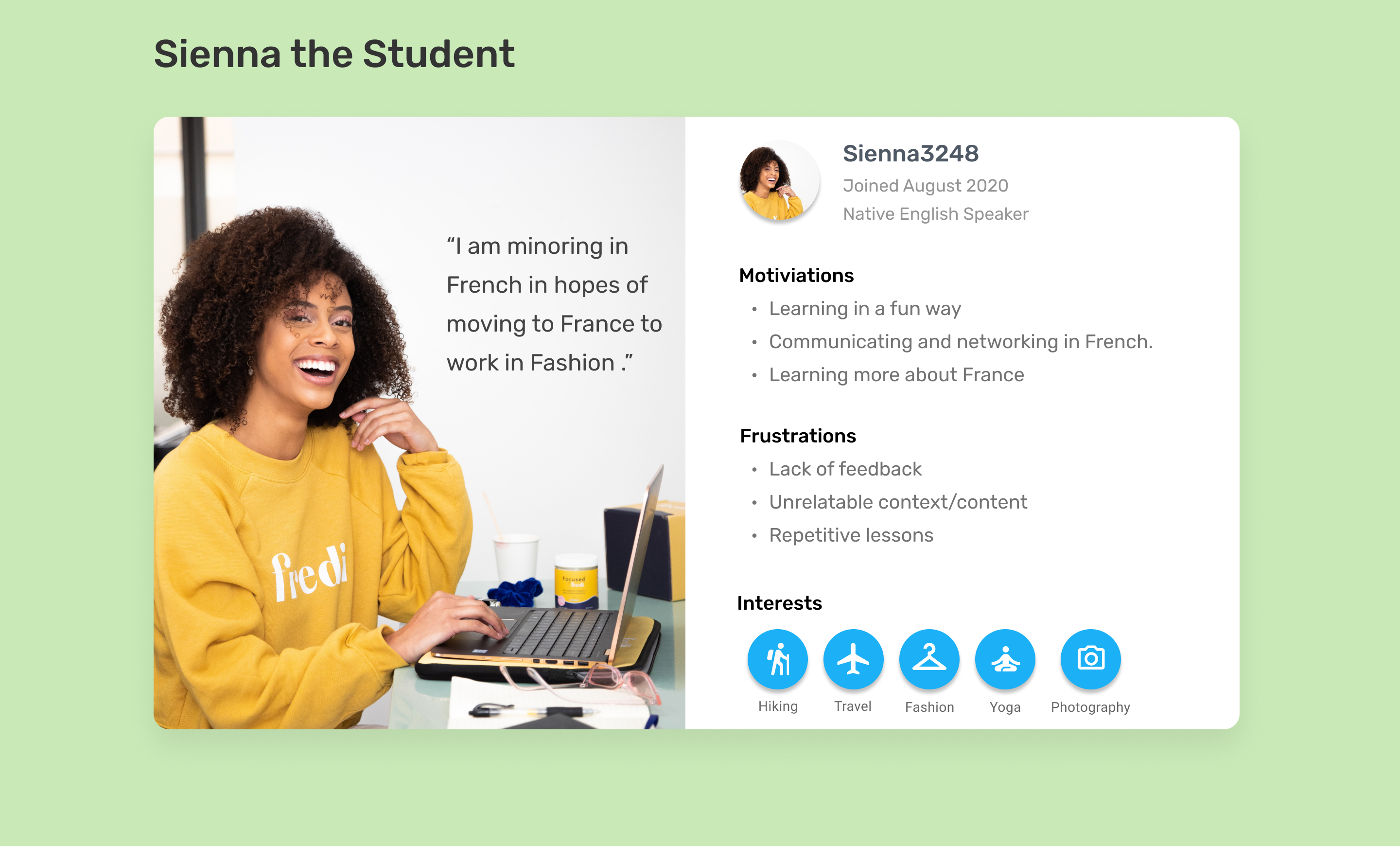
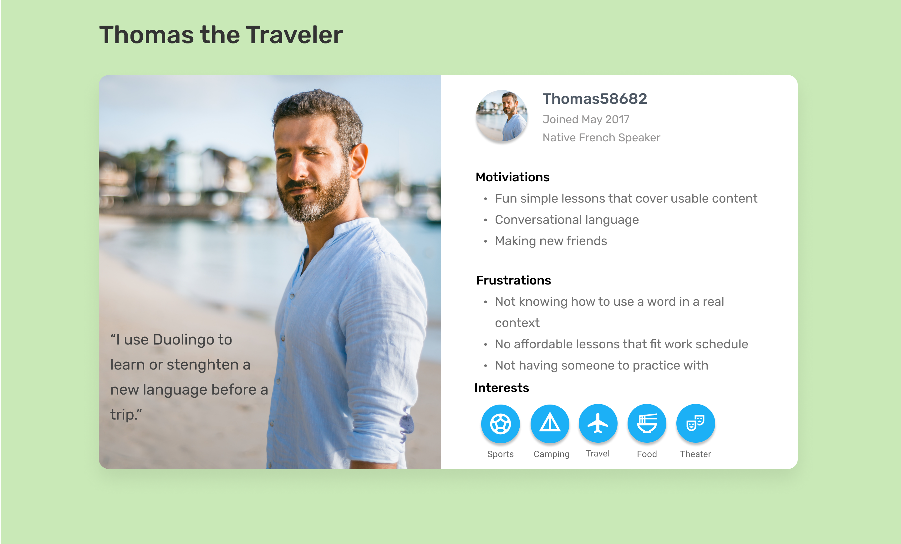
I analyzed the data collected throughout the interviews and created an affinity cluster. Sienna and Thomas were developed based on aspects and findings from the research process. I referred back to both these personas throughout the design process to ensure their needs were kept in mind.
Storyboarding
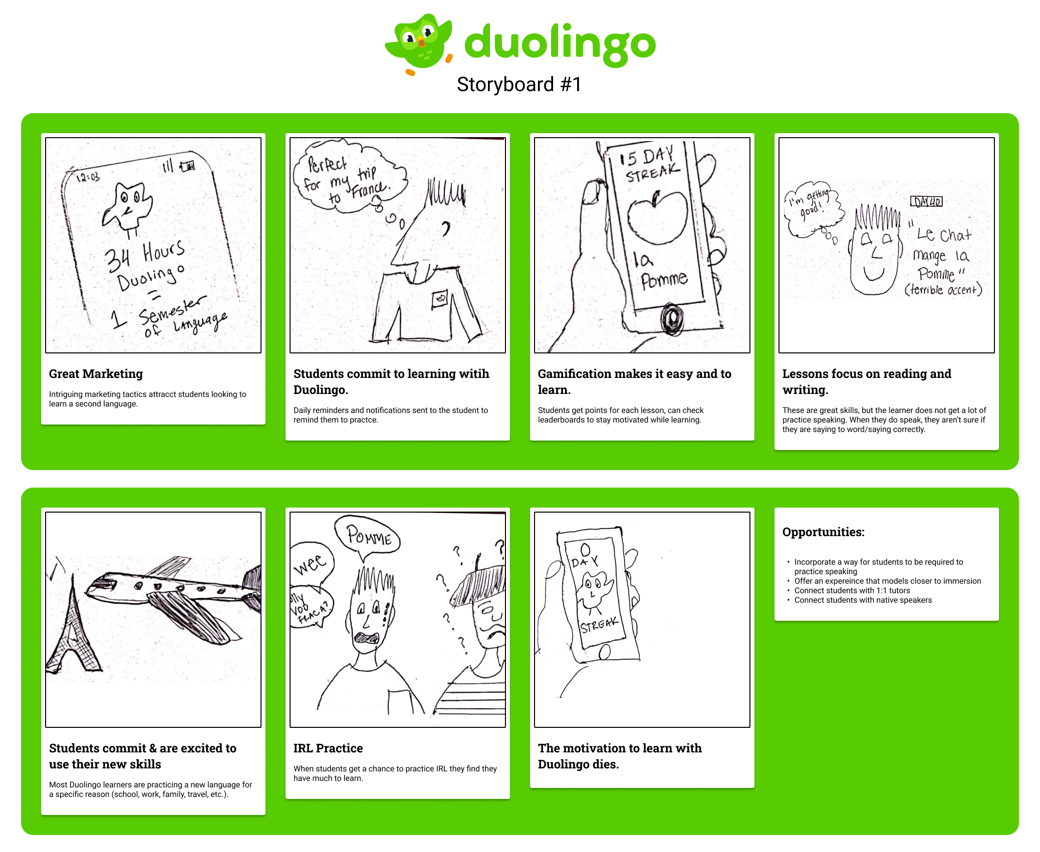
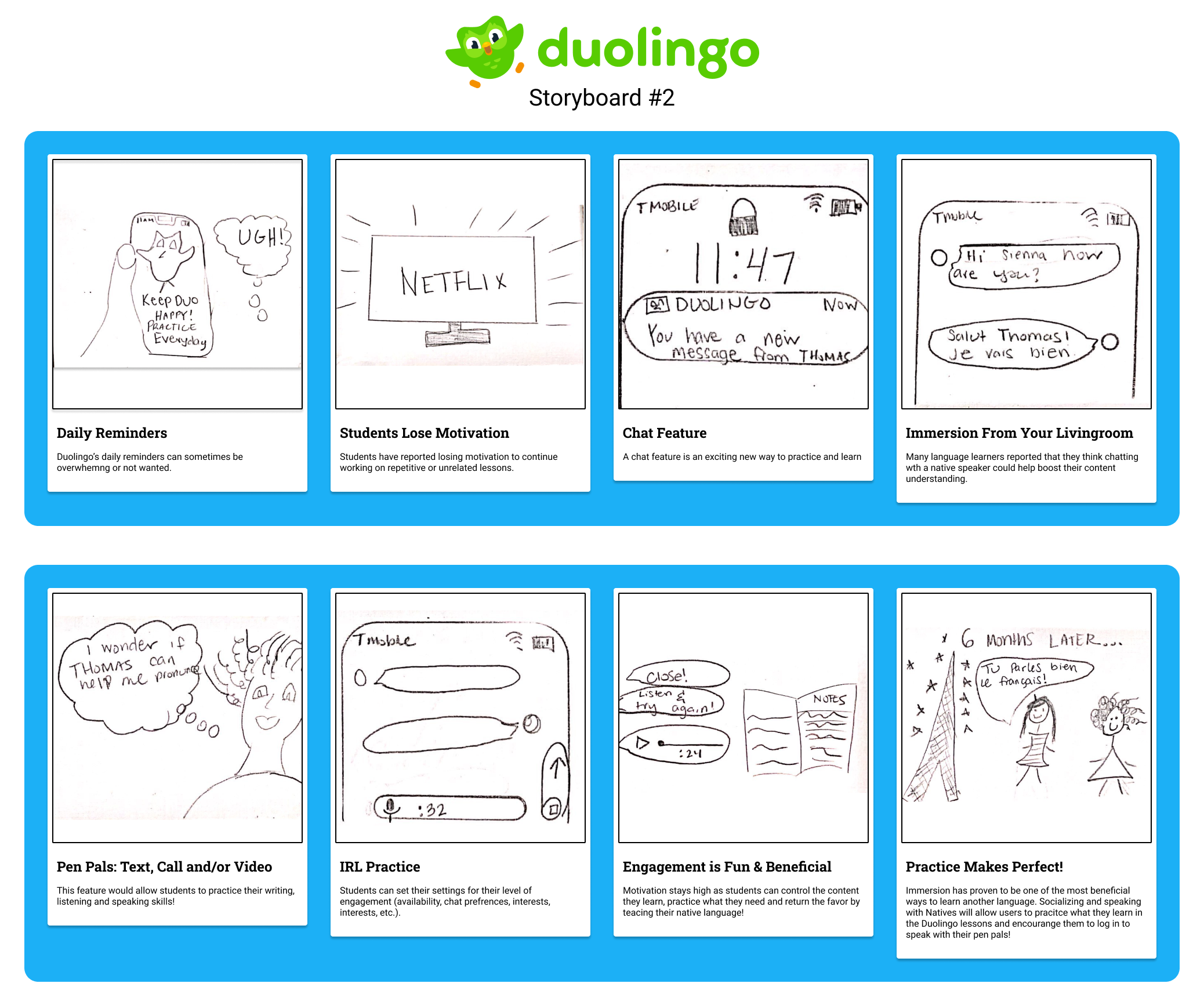
While researching and defining Duolingo Chat I created two storyboards to help shape the user's journey. I first created a storyboard to outline a user's current experience of using Duolingo. This storyboard illustrated concepts found from research and empathy interviews.
The second second storyboard highlights opportunities, strings together user stories and personas to develop the chat feature's product requirements.
Point of View / How Might We
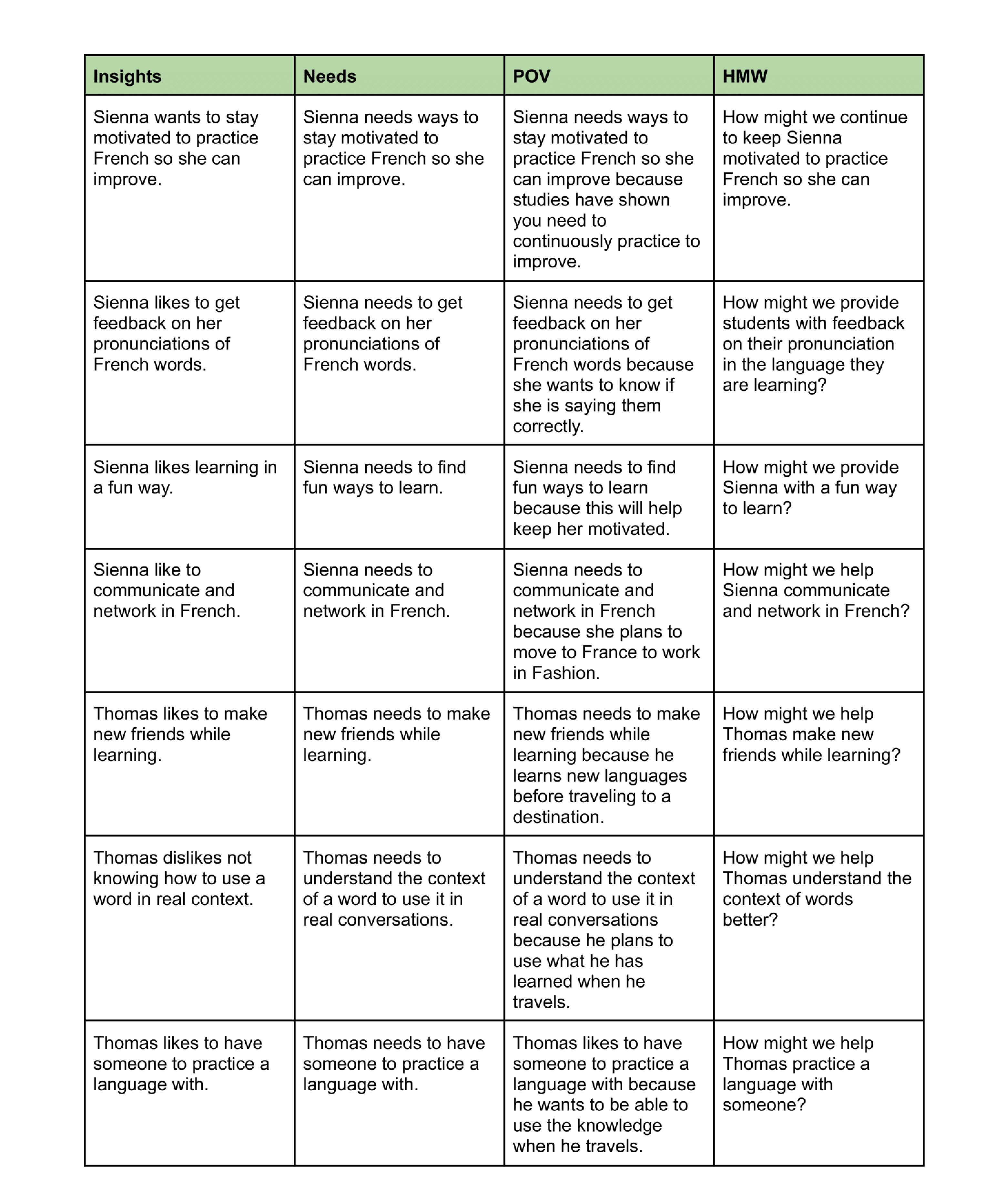
I conducted How Might We as an exercise to help me visualize problems as opportunities. I did this by rephrasing challenges as questions.
Explore: Ideate & Prototype
The exploration stage was kicked off with creativity and innovation. I used various techniques and exercises in order to develop solutions.
Crazy 8's
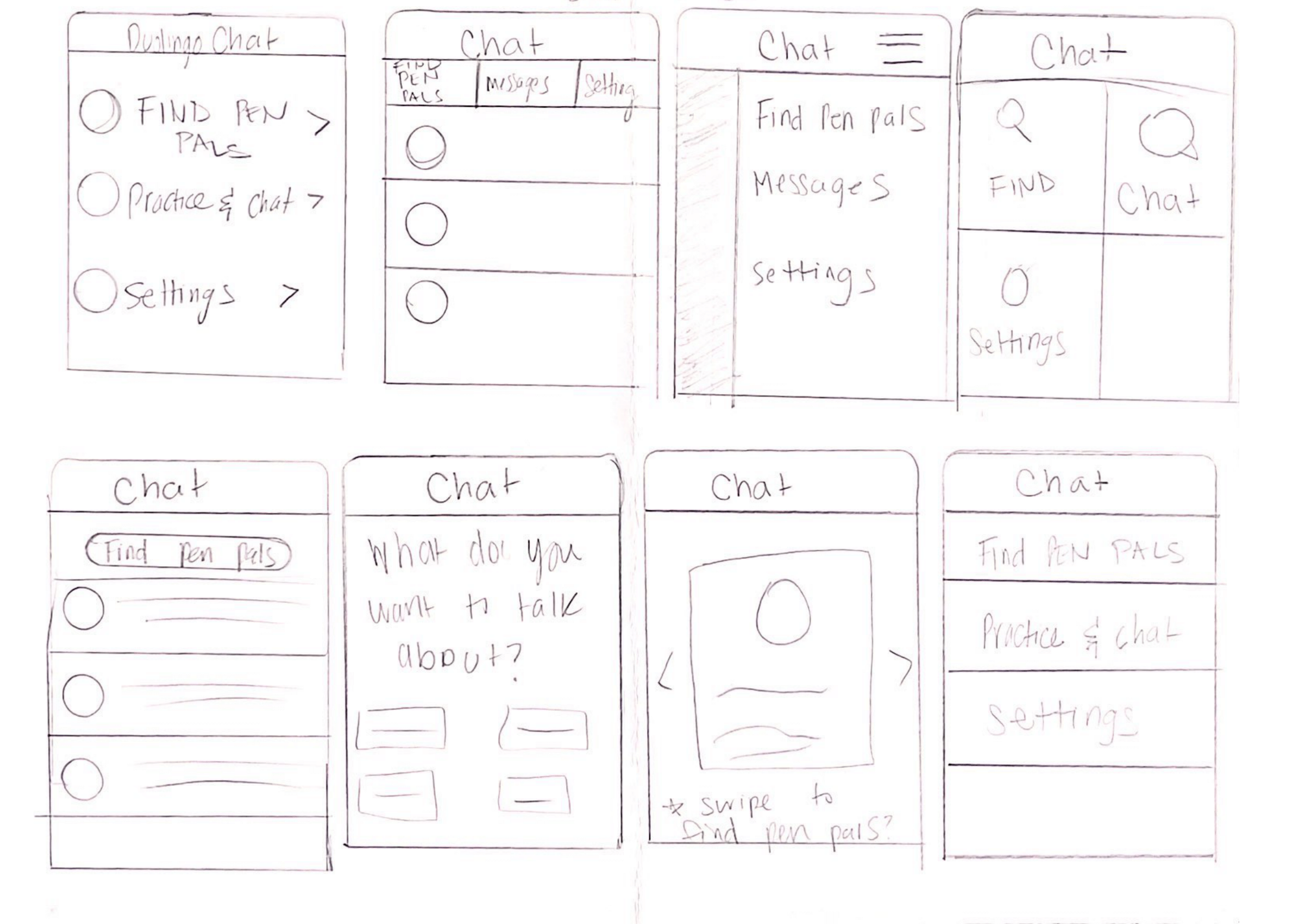
I set an eight minute timer and sketched eight screens within that timeframe. This exercise required me to think rapidly, design various screens and challenged me to push beyond one design to generate solutions.
The Golden Path
I mapped a user’s ideal "golden path" to help identify the key steps that they would need to take in order to find the chat feature's real value. The path focuses on the user's intent and outcome instead of exceptions or errors.

Wireframes
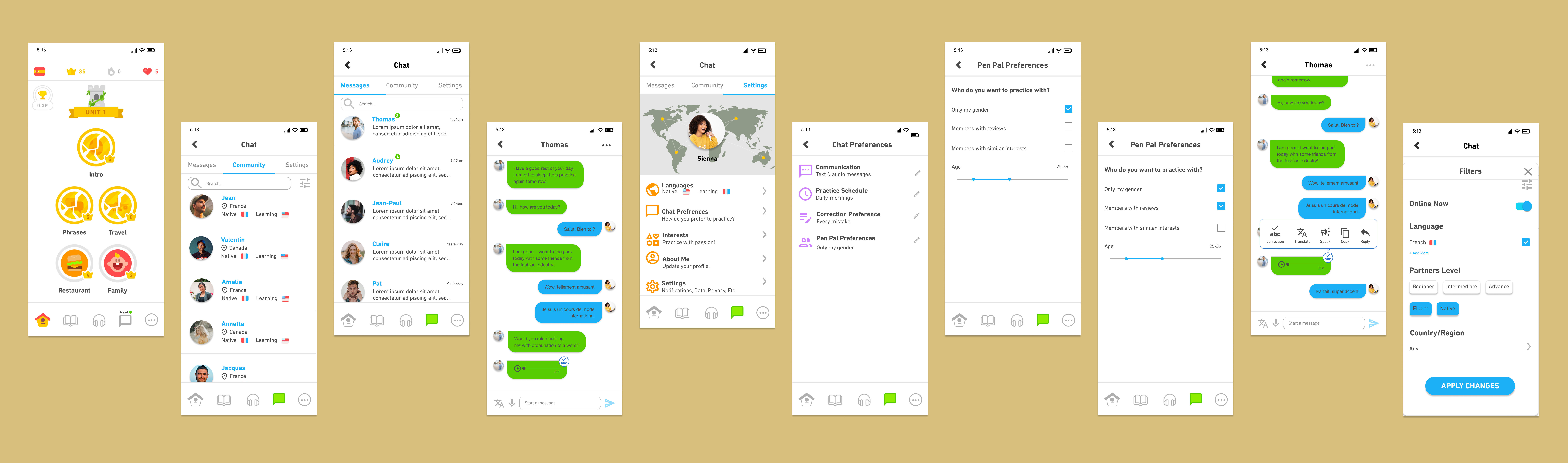
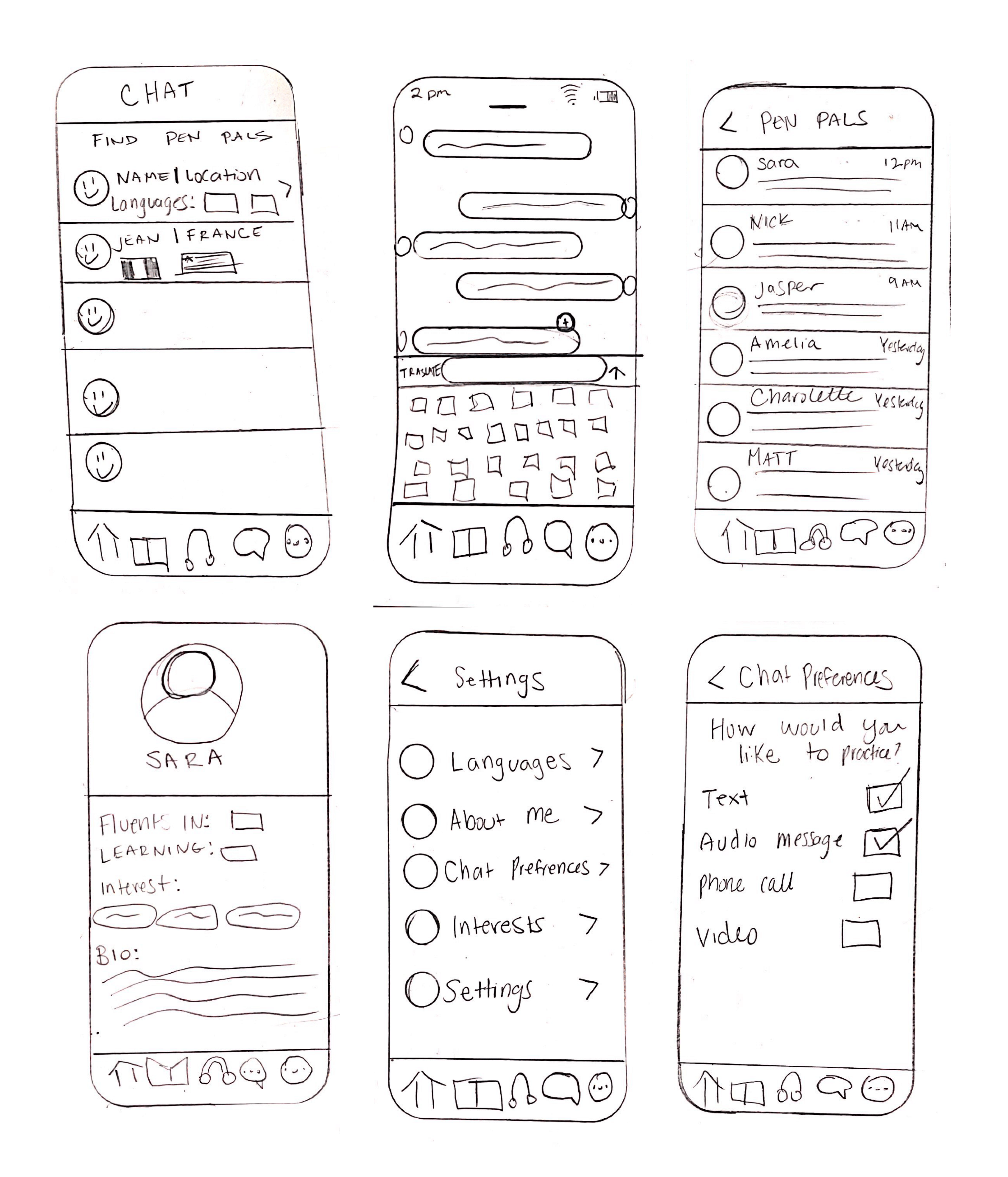
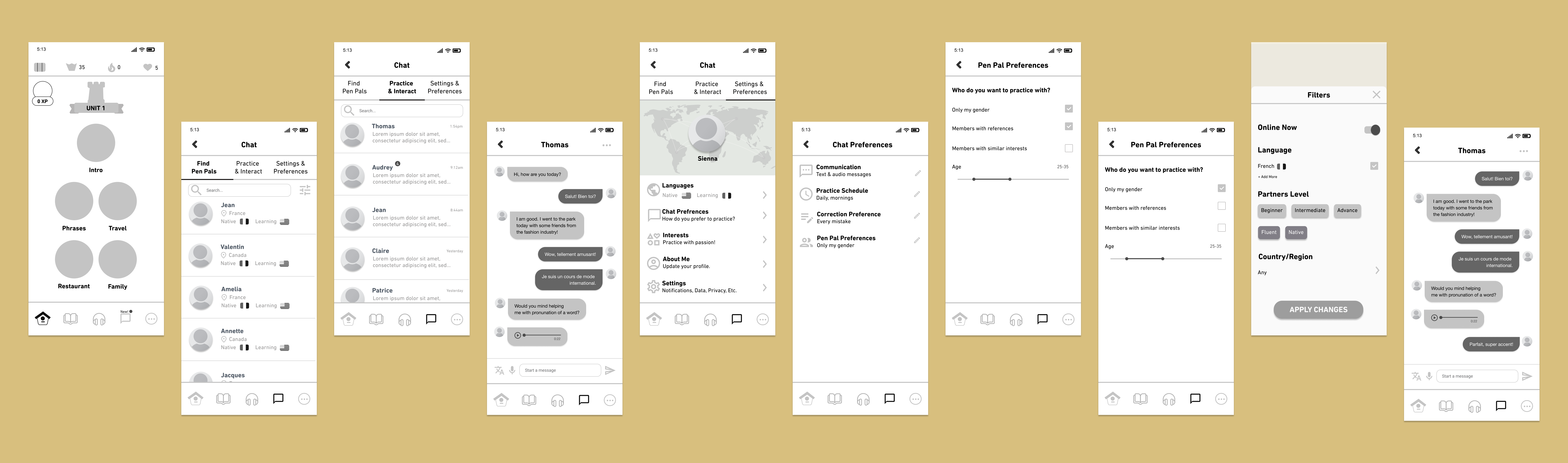
Low-fidelity wireframes were sketched and designed for mobile first. Next, I developed mid-fidelity wireframes in Figma. Each screen and changer was designed with SOY users in mind.
Prototyping & Usability Testing
I recruited users to validate a mid-fidelity prototype to test the design of the new chat feature. The prototype was built for Duolingo's mobile app using Figma. The prototype test was created using Maze.
Usability Test Objectives: To test the overall ease of the new feature and to see how users interact with the immersion tool.
Methodology: Rapid, remote testing via Maze. Participants were asked to complete three missions and answer various thought provoking questions. Actionable insights such as mission duration, mis-clicks and mouse tracking were recorded throughout the test.
Participants: 14 participants
Solve: Test & Implement
Feedback Grid
After completing each usability test, I reviewed my notes and the test recordings to create a feedback grid. The feedback grid outlines what worked during the test, questions and ideas that participants had. This helped me understand what high priority iterations need to be made.

Branding
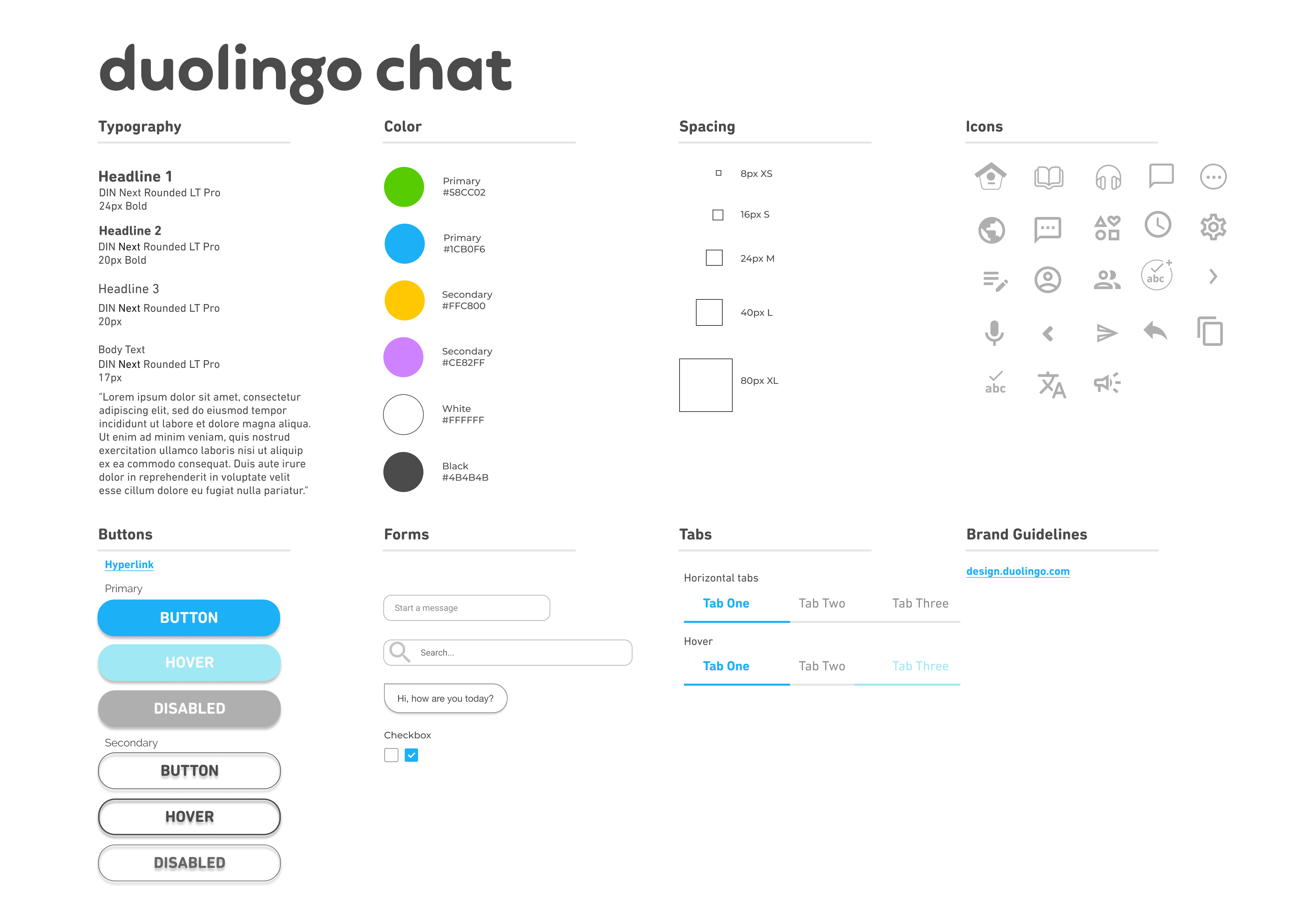
The chat feature is branded using Duolingo's brand guidelines so users can seamlessly transition from one function to another.