Financial Services
A simplified way to audit digital compliance.

The Challenge:
Every day at 3 pm, the client's dedicated team of Field Supervisors faced a daunting challenge – a deluge of applications demanding thorough compliance reviews within a mere 24 hours. Each application was a labyrinth of intricacies, housed dozens (sometimes hundreds!) of scanned forms, and required the user to investigate various linked tools to find specific information. The complexity of the process and the time constraints imposed a significant burden on the advisory team. A transformative approach was needed to streamline their workflow and enhance effectiveness in ensuring digital compliance.
Our Influence:
Working collaboratively across three teams within the Digital Compliance and Supervision portfolio, my primary focus was advocating for users, driving pivotal shifts in product direction to harmonize with both business and user experience objectives. Managing design responsibilities for each team, I facilitated design sprints, scoped tasks, and established targeted milestones.
In addressing the challenges faced by the advisory team, my team and I embarked on a mission to modernize the insurance review process. Our proposal estimated 35% reduction in processing time. This outcome was achieved by meticulously redesigning the workflow with our users steps in mind, integrating user-friendly interfaces and efficient tools.
My Role:
Researcher, UX & UI Design
Timeline:
September 2023 - January 2024
Tools:
Figma, Mural, Jira
Information and data points altered and/or redacted to maintain client confidentiality.
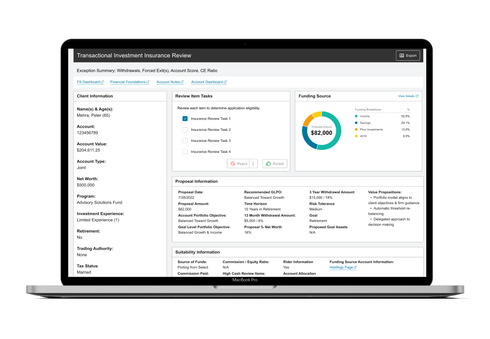

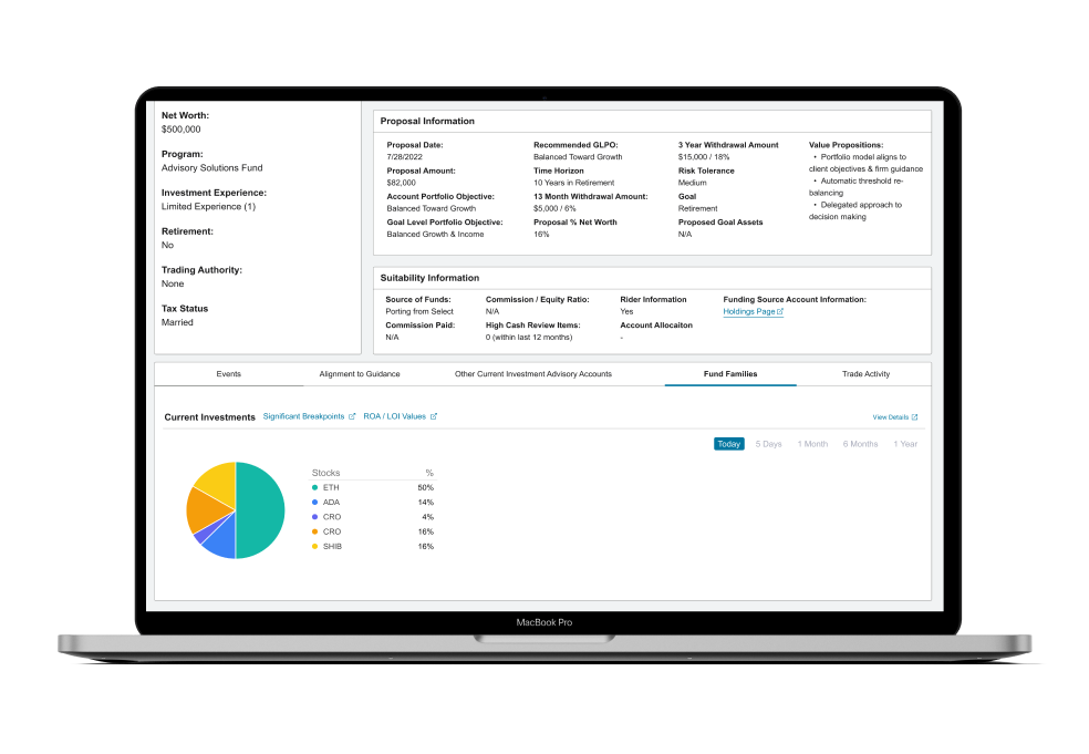

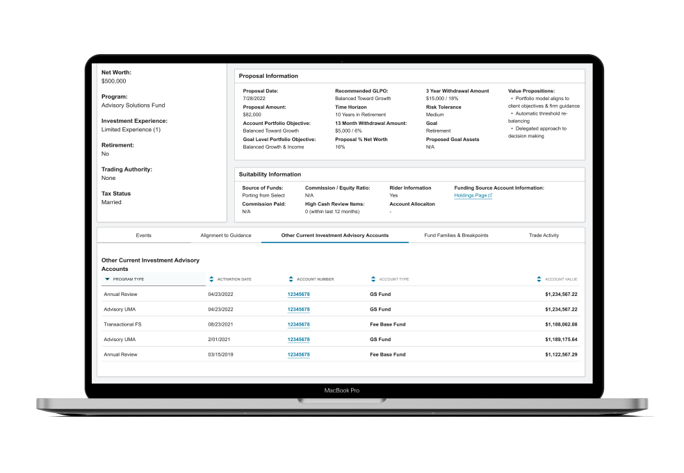
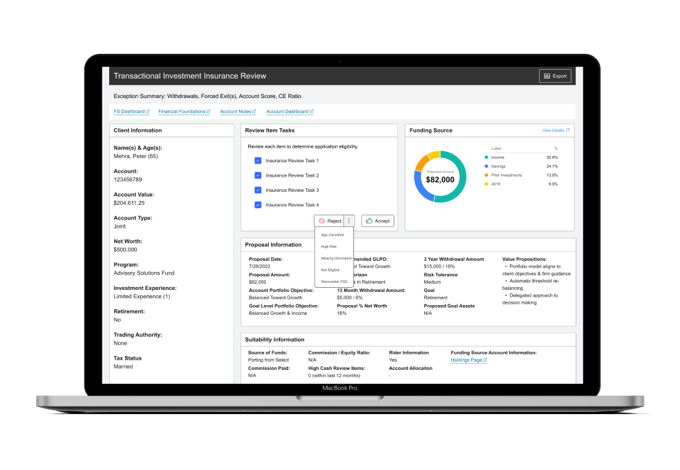
When I joined the project, the digital compliance team had already redesigned two different review items. Although these new designs included major enhancements to the advisor's workflow, they lacked consistency. To advance enterprise functionality across all compliance review items we needed to dig into research to create a reusable template that could be adjusted for each type of review item to accommodate the various data points and documents while providing a uniform experience for users.
To gain an understanding of how the current systems worked, I reviewed the previous research and observed various users as they reviewed a few different insurance applications with the "Classic" experience. There was a lot of manual work and hunting that the field supervisor's team was required to do to check one review item off their long list. They were needed to comb through dozens of scanned written pages and train their eyes to sort through uncategorized data to find precise information. Users were slowed down by needing to track down information across various tools and systems (Porch, FS dashboard, Application history notes, etc.). With that in mind, it was time to go back to the drawing board, with a focus on how to categorize data that was relatable and minimize clicks to enhance workflow and decrease processing time.
Conducted comprehensive research encompassing various facets, including reviewing documentation on frequently used review items and their corresponding training guides, engaging in technical discussions with developers and solutions architects, gathering insights from the user base, and holding discussions with program managers. Additionally, employed user-centered methods such as card sorting and organizational workshops.
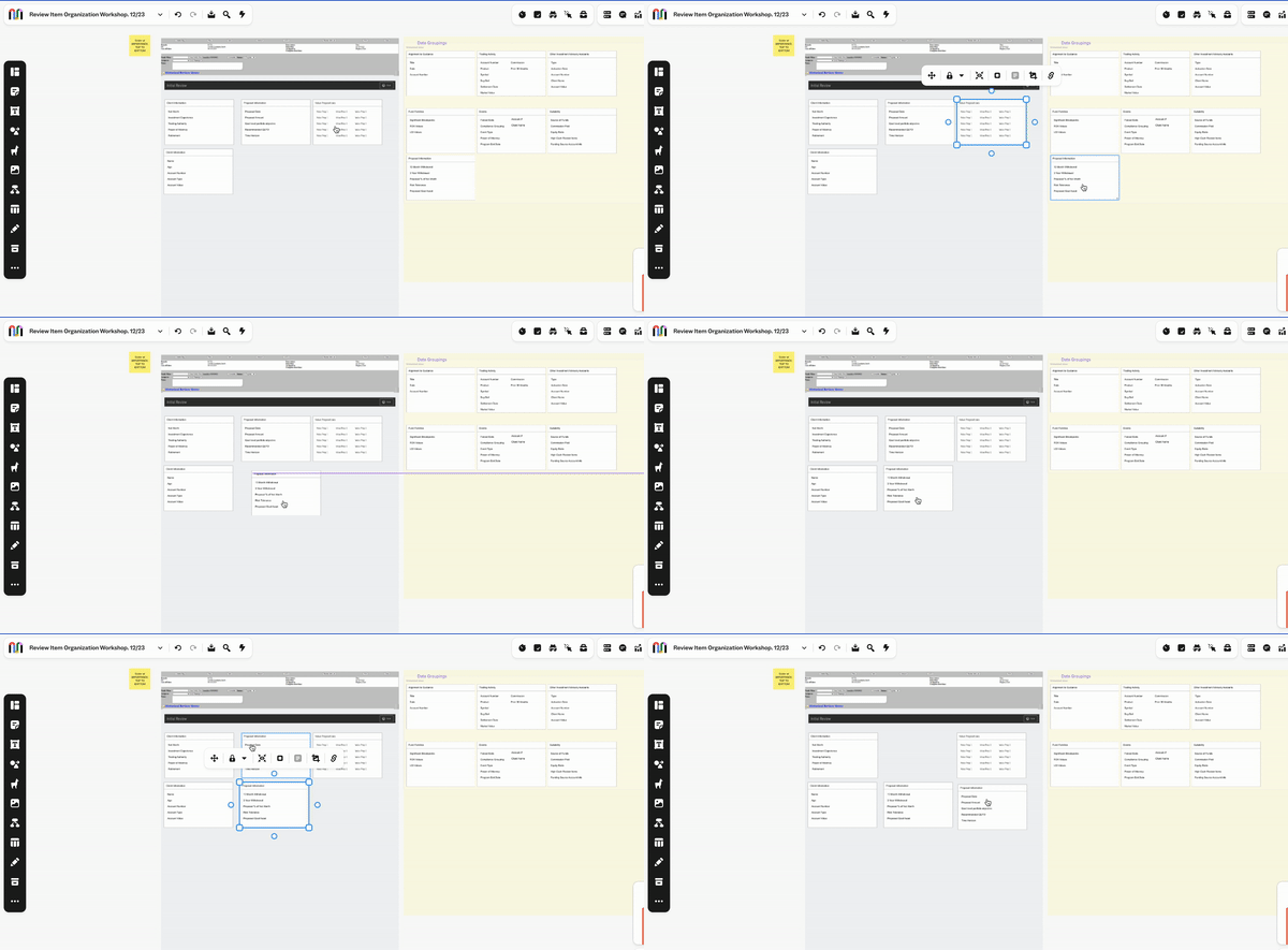
Key Insights :Discovered valuable insights into user preferences regarding data grouping and identified specific data points frequently compared or cross-checked with the original application. Worked with the team's solution architects to ensure we could include new data requested by users into the application.
Design Process: Utilized low-fidelity cards developed from the card sorting exercise to conduct an organizational workshop in Mural. During the workshop, users were prompted to drag and drop the cards onto wireframes, providing an interactive platform to ideate on ideal data placements. In-depth discussions revealed the necessary groupings of data for each review item, with a focus on de-prioritizing certain information. Through collaborative discussions, it was determined that a tabbed design could effectively simplify the review item without sacrificing essential information. Tabs were then organized based on access priority, streamlining the overall user experience.
In our research and discovery phase, I identified a shared desire among users and business goals for a formalized process to accept or reject applications, eliminating the need for direct messages to the client's advisor. To address this, I introduced a checklist; upon completion, it triggers the accept and reject options. This streamlined approach empowers the compliance team to systematically ensure all necessary steps are taken before advancing the application to the next stage or automatically providing feedback on rejected applications.

The redesign of the insurance application review workflow resulted in an average of 35% reduction in processing time. The integration of user-friendly interfaces and efficient tools significantly improved the experience for field supervisors. The firm plans to utilize the re-design as a template as they move forward with updating other types of compliance review items.
Throughout our work, my team helped triple the account revenue for Accenture, converting them to "diamond client" status.
In numbers:
Account was estimated to bring in 15 million and ended up totaling 44 million across multiple projects and partnerships.